I did a search of my articles and couldn't find it anywhere - obviously I didn't use the right keywords to identify the post.
SO
I thought I'd post a new one this year.
Easy-peasy and FREE!
Go to PicMonkey.com and click the "edit" icon.
It will take you to a bunch of folders - select the folder and photo you want to edit.
In this case I saved the back-to-school photos to my desktop to make them easier to find.
You're probably going to want to crop your photo.
I like the shots where the writing is down the side of the photograph, so I'm going to crop out a lot of the background, while still leaving space to the left.
Click the crop icon:
Resize and reposition
And voila! Less background, more subject!
I thought I might need to add an overlay since the background where I want the text is pretty busy...
Click on the butterfly icon and then you can choose whatever overlay you want - banners, badges, shapes etc. For my purpose I just chose "Geometric" and then the rectangle which I sized to fit my space.
You'll notice my rectangle is slightly transparent. On the right side of your screen you will be given the option to change the colour, size and opacity of your overlay. I simply faded mine out slightly.
Next up - the text!
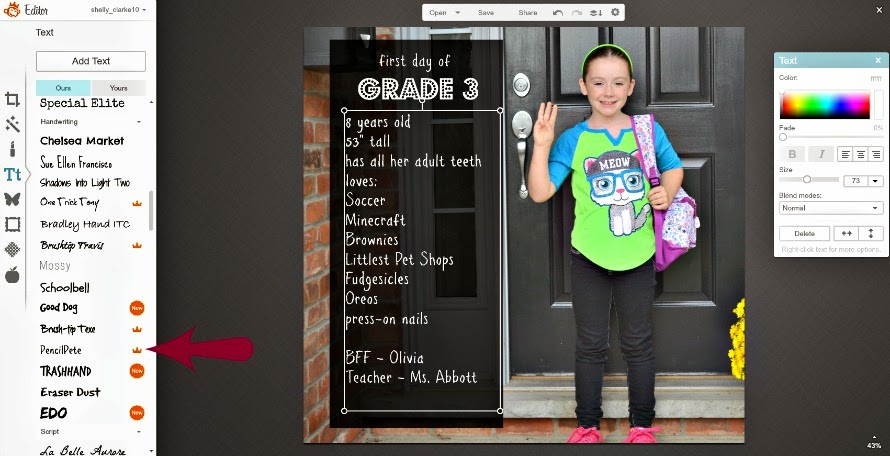
Click on the "T" on the sidebar and then select from the list of fonts.
Click on your font choice and then click "Add Text" and it will give you a text box in the middle of your screen.
Click and drag to move it wherever you want.
Again, you'll see the pop-up box on the right side of your screen that will allow you to change the colour of the font, the sizing etc.
I wanted a couple of different fonts in different sizes, so once I had my "Grade 3" ready, I went back to the font screen, chose a second font and clicked "Add Text" again.
From here I could input an entire list of items.
Just so you can see how it would look without the overlay - I clicked on the rectangle shape and deleted it. You can see that the words are lost between the brick and the sidelight.
Easy enough to fix - click the undue arrow on the top of the screen!
What a great way to commemorate back-to-school.
Better still - you can airbrush out pimples, add funny overlays to create birthday and/or Christmas cards.

Linked to:
 |
| Between Naps on the Porch |
 |
| Tatertots & Jello |


I prefer my photos sans text. It makes them look like magazine covers to me--which I also prefer with the least amount of text possible. Labeling on the back or, if in an album, on the page below the photo works best for me.
ReplyDeleteFair game - this is more for people who like to give keepsakes to friends and family, or for those that like to create their photo albums online. There is something more personal about handwritten notes though.
DeleteBeen searching all day for fun, free ways to create effects.
ReplyDeleteI have photoshop elements 11. I purchased it 2 years ago and still have yet
to accomplish anything with it. Ok so I am 60 but I can follow directions.
I glanced at Picmonkey but I am the type of person who needs the directions
how to use it. SO a BIG Thank You from Me.
Linda C In Seattle.
You're very welcome Linda, but if you ever do take on photoshop - perhaps you could teach me? I'd love to learn that as well!
DeleteThanks for taking the time to comment - really means a lot!
Thank You so much for this post. I have always wondered how to do that. I have hardly any tech skills so this should be easy for me.
ReplyDeleteYou're going to love it and become addicted! Once you're comfortable with the text part, you can go wild with overlays (like the butterfly and moustache above), and they even have an airbrush option to get rid of those pesky pimples that only appear before a family photo. lol
DeleteHave fun and thank you for commenting!